As you approach the behemoth that is your local supermarket, grab a trolley, and look up your list on your phone, do you ever wonder why you never stick to that list? It’s not a sign of weakness; supermarkets are specifically designed to squeeze as much money out of you as possible, and uses a series of psychological tricks using its layout.
Imagine a typical shopping list for a midweek shop for your ‘bits’. Bread, milk, cereal, maybe some lettuce for your lunchtime sandwich? Easy enough to stick to, right? Well, supermarkets are determined to distract you enough for you to overspend on food you don’t need.
Many larger supermarkets now have barriers set up behind the entrance, so there is literally no turning back. The only way to exit is through the checkouts, forcing you to walk past tempting products. The entrance is the most important part of the supermarket, and most are keen to make a good first impression. It’s here where you’ll find floral stands, hot baked goods and fresh fruit and vegetables. All of these are chosen to positively assault the senses. Pleasurable sights and smells will give the customer a feeling of optimism as they start their shop. But also note: all of these products also have very high profit margins! Putting these products at the bottom of your trolley at the start of your shop also makes little sense, as they’re all delicate and will be crushed by canned goods later!
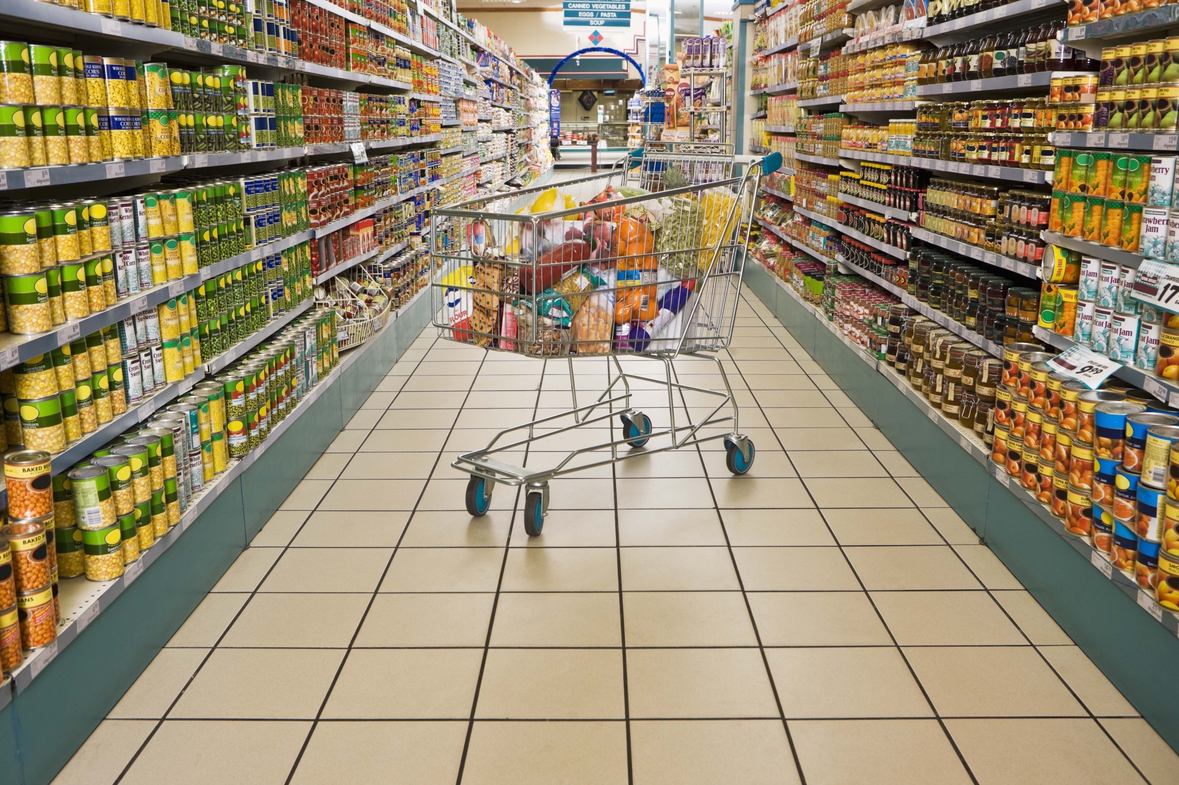
If you’re just popping in to get bread and milk, you’re out of luck. These two classic essentials, alongside other everyday products, are usually stored in the back of the supermarket, forcing the customer to walk past rows of other products. This means you’re exposed to as many products as possible before you get to what you actually need.
Once you’ve reached the milk, you, like most other customers will walk the perimeter of the layout and dip in and out of the aisles depending on what you might need. This is where ‘gondolas’ come into play. These are the reserved sections at the end of the aisle where the special offers usually are. Big brands have been known to spend up to £1 million for a gondola placement on one of the ‘big four’ supermarkets. However, a new trick supermarkets use to boost sales is to simply place the products there, surrounded with red and yellow stickers but with no actual offers. This technique makes a profit because of our established psychological connection between the end of the aisle and a good bargain.
Once you’re in the aisle, note how supermarkets have now applied their own classification system to shelves. Generic or store brands are always on the bottom shelf. Big brands are on the middle shelf, or ‘eye’ level, where our eyes will usually rest. Luxury or more expensive brands will lie on the top shelf. The psychology behind this placement is that bargain or quality hunters will go out of their way, but the average hurried shopper will grab what is in front of them.
Another popular supermarket method is the special ‘celebration’ display that puts together all the products you’ll need for a certain event. There seems to be something every month, and supermarkets have started to grab at straws to create events in our mind in order to sell party goodies, it’s now common to see special stands for TV show finales, Football tournaments, and the mythical ‘Barbeque Summer’. These displays are designed to encourage you to buy more because everything feels like a ‘perfect accompaniment’ to something else, causing a spending chain reaction.
Supermarkets are also huge fans of colour psychology. Reds inspire feelings of urgency and so is the colour of sales – ‘grab this before it’s too late!’ Blue inspires trust and a feeling of reliability – hence a ‘blue cross sale’. Purple denotes luxury and royalty, and is used to decorate sections that sell high quality food.
If you’re feeling stressed out from all of these tricks and fancy a glass of Merlot from the wine aisle, you’ll notice how aisles that sell alcohol are designed slightly differently to the rest of the store. More recently built stores have started to turn the wine aisle into a little oasis of calm, using wooden floors, grape vine decorations and mellow colours and lighting. These are all techniques used to put you in the mood for an alcohol purchase.
The till is where the big bucks are made. The English are famously tolerant of queues, but this has ebbed in recent decades as our lives become busier and now most of us want to leave as soon as possible. This distress leads us to buying just a little extra – and thankfully the mini aisles by the till provide us with plenty of sugary treats!
The strangest element of supermarket psychology is that most of us know that we’re being duped, and we’re all perfectly aware that the £2.99 piece of beef is essentially a £3 piece of beef. Yet we still fall for every trick, like willing subjects. As the power of the supermarket spreads, they will always be concocting new ways to push their products, old and new.
Tips for the Small Business Owner
- Product Location – Where are you placing your most important products in your store or on your website? Are the most popular products with the highest profit margins the easiest to find?
- Price isn’t everything – Just like in the supermarkets, most people buy the more expensive branded goods even though there are cheaper alternatives. Most people’s purchasing decisions are not motivated by price when you effectively sell value.
- What else can you sell? A minuscule proportion of people who walk into a supermarket only buy one item. Think about what else you can sell your customer. What else might they be looking for when they visit your store or website?
- Discounts – Supermarkets usually run discounts to get people in the door. Can you discount one item to bring people to the store, then upsell something else whilst they are there? If done in a strategic manner, discounts don’t have to hurt your profit margins if they lead to sales of other, full-priced items.
- Event Marketing – Like the “celebration” displays used by supermarkets, can you latch on to any local or national events in your marketing? Can you offer a package or put together a special promotion based on the theme of a holiday like Halloween or Thanksgiving?
Rob is a writer who works alongside http://www.design4retail.co.uk/. He is a self-confessed marketing geek who writes on a range of subjects that interest him such as merchandising, the retail economy and store design.


