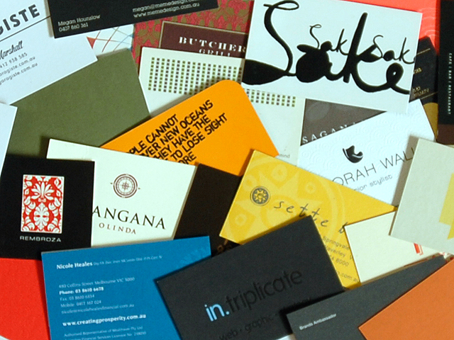
A forest of business cards: Japan (Source)
There is no denying that there is less print media involved in the business world today. With advances in technology as well as our complete reliance on the internet, individuals instead can opt to share electronic contact cards, twitter links, QR (Quick Response) codes and addresses to websites. It is even quite conceivable that no print marketing may be necessary for some companies as all of this can be handled in the online world, whether it be through a blog or a LinkedIn referral. There is however one aspect of print marketing that lives on and that is the business card; and you would be wise not to forget this rather remarkable form of marketing.
What Makes a Good Business Card
In order to get the most out of your business card, you should consider hiring a specialised printing firm who have quality business cards printers that will give you the edge you’ve been seeking. The best and most effective business cards usually involve a set of certain criteria:
- They are normally unusal in some kind of way.
- The card coherently exemplifies the services and quality of the company at hand.
- They follow the ‘less is more’ rule and are do not burden the reader with unnecessary and irrelevant details.
In essence what we’re trying to say is that a business card can become a micro-portfolio of the work you do.
What Makes a Bad Business Card
Now that you know what making a good business card entails, you should also be very wary of what makes a bad one. There are unfortunately some rather awful examples in circulation such as business cards with incorrect spelling, old phone numbers crudely scratched out and replaced with a new one, and generally all business cards with hand-written amendments that lack the basic rules of presentation. Another example of a bad business cards are do-it-yourself ones with the use of perforated edges for little reason. If you are unable to get your business card right, it immediately sends out the wrong impression to potential clients or consumers and you will suffer for it.
Some Other Useful Tips
Though you don’t want to go overboard with too many presentational gimmicks, you should still aim to make your business card eye-catching and fairly unique. Instead of using the traditional landscape view, you could try flipping it into a portrait style one. Remember, as much as people will be looking at your business card, they will also be feeling it with their hands too, so you can try a variety of textures as well. Some examples of business cards for particular businesses could be a drinks company printing on a coaster shaped card, or a flooring company printing on thin-wooded strips. When it comes to specific design specs, you should aim to use a minimum of 300dpi (dots per inch). The material which you choose to print on should also be high quality and be able to withstand minor scrunching and tears. It really comes down to making your company memorable and though a business card is just one of the ways to do it, you should never forget it importance for putting your company out there.


