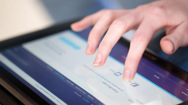
Let’s just pay attention to the fact that perfect eyesight isn’t something that everybody has. Some don’t even have near-perfect vision. A large population has problems viewing and unfortunately a lot of people have absolutely no eyesight. Visually impaired people are often marginalized. They are rarely ever the first choice for any business which is unfair. It would serve any sized business, however, to realize that there are approximately 21.2 million adults- in the U.S. alone- who have difficulty seeing even when they have the assistance of glass or contact lenses.
By including the visually impaired as part of your target niche, your small business can take advantage of these statistics. As a small business you would just need to hire a web design company which could make your website usable for people who have trouble with their vision, as well as those who have a good vision. Obviously, since putting Braille on a computer screen isn’t exactly an option, there are other ways you can make your website optimized for easy interaction.
Big is Good
Although not true for everything in life, when it comes to your website being friendly and usable for the visually impaired, it is certainly true. Because of smaller font sizes, some people have trouble reading the content. When you make the text on your website larger than normal, seeing and using your site will be so much easier for those who would otherwise have trouble.
Do remember, however, not to compromise the visual appeal of your website by implementing these changes. You want to attract more customers, not get rid of your existing ones too.
Be sure to specifically let the web design company know what you are looking for when you hire them. If you want, you can make another site as an alternative to your main site that is made just for people who are visually impaired and put a link to it on your main site. This way you can make larger images and text to fit into the size of this second site.
Color Combinations to be Avoided
For people who have trouble seeing or with colour blindness, you might want to make sure that you are using the color combinations that are within the regular browser safe ones. Tones which are lighter will be much easier to read and see. When you have lighter tones on a dark background, this will be easier to view. If you use two lighter colors that are of a similar shade, this can be frustrating for those with color-deficiency issues. As with websites for normal people- the layout of your site optimized for the impaired need to be just as clean and clear. No clutter, no unnecessary graphics.
Seeking Audio/Visual Help
Music is something that most people like. When you use audio and media within your website design, it can be of great help to anyone who is impaired visually. You can add a video which will explain most of what the text on your site does so that those who prefer can listen instead of read. You could even have an audio accompaniment that is similar to Siri added to your website by a professional web design company. This type of aid will recite the words on the screen back to you. Adding key functions can help the impaired Pause and play, and rewind the audio. A mute button should keep the normal vision people happy.
A web design company can do many other things to help make your company’s site even friendlier for the visually impaired. It isn’t always an easy task, and chances are that not every company is doing this but it will be worth it for both your customers and your business over time.
This article was written by Morgan Shapero, who believes that a simple call to the web design company can have small businesses raking in more customers.
