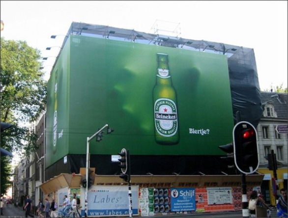
 Banner advertisements are a great way to get your message across to your public and create much more awareness for your business, but not all outdoor banner ads work in the way they are intended. Whilst a great outdoor ad will bring in much needed leads and sales, an ineffective one may not be worth the material it’s printed on.
There are many different styles of advertising banners, from A-boards that stand proudly outside your business pointing the way for potential customers to large PVC banners that look down on the baying public, hoping to create a natural footfall towards your business. But what are the key components of a great ad?
Colour
The main thing that you want your ad to do is stand out. When potential customers are walking along the street they are literally bombarded with signage from every direction and so what chance do you have of making an impression if you don’t stand out? Bright colours are often the ones we notice the most but that’s not the only consideration when thinking about colour. Colour psychology is also an important part of the decision and companies often pay big money to be advised on the best colour to choose for their marketing campaigns. For example, red can mean either danger or passion whilst yellow denotes joy and intellect.
Font
The style of writing used in the ad is also something that requires a lot of thought. There is no point having a really elegant font that gives of the impression of opulence if nobody can read it from further than two foot away. Practicality should always conquer style but ideally it would be great to find a balance between the two.
The Optimum Amount Of Information
With the busy lives that we all lead, nobody really has the time to stop and read a sign or banner ad that has excessive writing on it. However, at the same time it is important to include all of the relevant information so that you are leaving everybody in no doubt about the who, what, why and where of the message you are trying to get across. The best approach to take is to provide the minimum information needed and then direct them to another resource where they can find out more should they wish to.
A Hook
Unless you are already an established name, the chances are that the general public are not going to be moved too much by your advertising banner unless there is something in it for them. With this being the case you need to include a hook in your ad that gives them a reason to take the next step. This could be either making an enquiry about more information or heading straight for your business premises. A great hook could be a special offer for new customers or a clear outline of what your USP is as a business.
A Prime Location
Nobody wants to go through the effort of ensuring that everything above is taken care of only for the ad to be placed somewhere with very little footfall or where nobody can actually read it. Ideally you would want your advert to be positioned in close proximity to your premises in order to capitalise on people’s impulses, but there’s also a need to place it somewhere it will receive maximum impact. This could be in a place where people will be standing around passively, such as a bus stop, or somewhere that puts your ad in front of a lot of eyes, such as a busy high-street.
Once you have crafted the perfect outdoor banner advertisement you will want to ensure it is made with quality and to your exact specifications. That’s why it’s important to choose a reliable printing company, such as this, when producing your physical ad.
By Chris Mayhew


